Configuration
Every option below is also available in the visual editor — no YAML editing is required. This page is the reference for what each one does.
Surfaces are themed, not configured
Backgrounds, borders, corners, shadows and translucency are not card options. They are CSS custom properties. See Theming.
Sources
Where the card gets its alerts. At least one of entity, device, devices or sources is required; they can be combined freely.
| Option | Default | Description |
|---|---|---|
entity | (required, unless device, devices or sources is set) | Alert sensor entity |
entities | — | Additional alert entities to merge (e.g. DWD current + advance) |
device | — | HA device_id — auto-discovers all per-alert sensors under that device, and re-discovers as alerts come and go. CAP Alerts and NINA both produce this shape |
devices | — | Additional device ids, the same shape entities gives entity. An alert both devices carry is shown once; each device that goes dark is named on its own |
sources | — | Feed source attribute values to auto-collect, e.g. ['nsw_rural_fire_service_feed'] or ['inmet'] |
provider | auto-detect | 'nws', 'bom', 'meteoalarm', 'dwd', 'nina', 'meteoswiss', 'eccc', 'nsw_rfs', 'inmet', 'pirateweather', 'cap' |
Collecting a whole feed with sources
Some integrations create one entity per incident rather than one aggregate sensor, and that set churns constantly as incidents start and clear. sources harvests every entity whose source attribute matches, re-scanning on each render — so there are no volatile entity ids to hand-list:
type: custom:weather-alerts-card
sources:
  - nsw_rural_fire_service_feed
For INMET alerts, use the same shape with sources: [inmet].
sources is independent of provider: each collected entity still auto-detects its own adapter. In the visual editor this is the Auto-collect from installed feeds checkbox, which appears only when a matching integration is installed.
Filtering and sorting
| Option | Default | Description |
|---|---|---|
zones | — | Restrict to specific zone codes, matched against each alert's zone list |
sortOrder | 'default' | 'default', 'onset', 'severity', 'distance' (nearest the reference point first; area warnings sort ahead of every point incident, then severity and onset break ties; no reference point behaves as 'default') |
minSeverity | 'all' | 'all', 'minor', 'moderate', 'severe', 'extreme' |
maxDistanceKm | — | Hide point incidents further than this many kilometres from the reference point (HA home, or myLocationEntity). Point-incident alerts only (NSW RFS, and CAP Alerts entities that carry a single points marker, such as the Australian state feeds) |
myLocationEntity | — | device_tracker / person / zone whose coordinates replace HA home as the reference point, for maxDistanceKm, sortOrder: distance, the distance row and showMyLocation |
eventCodes | — | Event codes to include, e.g. ['SVR', 'TOR'] (NWS) or ['31', '95'] (DWD) |
excludeEventCodes | — | Event codes to exclude, e.g. ['SCY'] (NWS) or ['22'] (DWD) |
hideExpired | true | Hide expired alerts (set false to show them dimmed) |
hideNoAlerts | false | Hide the "No active alerts" banner when there are no alerts |
deduplicate | true | Collapse matching alerts across zones and providers |
deduplicateHeadlines | true | Suppress headlines that merely repeat the event name |
zones hides everything on providers that carry no zone codes
Zone lists are populated by CAP Alerts (UGC, SAME, EMMA_ID, NUTS and any other geocode scheme) and BoM (area_id, e.g. NSW_FL049 — fork-dependent; the safepay/ha_bom_australia fork emits it). Alerts with no matching zone are hidden, so setting zones on a provider that carries none hides every alert. The recommended NWS integration does not emit zone codes.
minSeverity never hides an alert whose severity is unknown or unclassified — those are always shown, on the principle that an unrankable alert must not be silently dropped.
maxDistanceKm measures from the card's reference point — your Home Assistant home location (Settings → System → General) unless myLocationEntity names a device_tracker, person or zone entity, whose latitude/longitude then take over. It applies only to alerts that carry a per-incident point: NSW RFS, and CAP Alerts entities whose points attribute names exactly one marker (the Australian state feeds publish one per incident). Area warnings (NWS, BoM, DWD, MeteoAlarm, MeteoSwiss, ECCC, PirateWeather, INMET, and CAP Alerts entities with no marker) either cover your home point or they don't, so a radius has no meaning for them and they are never filtered, even on a mixed card. If no reference point resolves, the filter is skipped rather than hiding everything; an entity that is missing or momentarily has no coordinates (a router-based tracker, a phone with GPS off) falls back to HA home rather than switching the filter off. The YAML value is always kilometres, whatever your unit system; on a US-customary install the visual editor labels the field in miles and converts to km when saving, so the stored config means the same distance on every install and flipping HA's unit system never changes what the card hides.
It also only ever narrows. The geo_location integrations that feed it apply their own radius first (nsw_rural_fire_service_feed and qld_bushfire both default to 20 km from the same home location), so incidents beyond that never reach the card. Setting maxDistanceKm wider than the integration's radius does nothing — raise the integration's radius instead. The integration's own origin can also differ from the card's: its latitude/longitude options live in its config, which the card cannot see. If you configured the feed somewhere other than HA home, point myLocationEntity at a zone with the same coordinates so the card's distances and radius agree with the integration's.
Presentation
| Option | Default | Description |
|---|---|---|
title | — | Card header title |
layout | 'default' | 'default' or 'compact' |
fontSize | 'default' | 'small', 'default', 'large', 'x-large' — scales text and icons |
colorTheme | 'severity' | 'severity', 'nws', 'meteoalarm', 'eccc' — the palette every alert is painted from |
providerColors | false | Paint each alert in the color its issuing agency published for it, over the colorTheme palette. On by default under colorTheme: 'eccc' |
enhanceContrast | 'subtle' | 'off', 'subtle', 'strict' — see below |
progressFill | 'track' | 'track' (thin bar) or 'background' (whole-row wash) |
progressStyle | see below | Per-phase progress-bar decoration |
iconBorderStyle | see below | Per-phase icon-ring border style |
animations | system | true, false, or respect prefers-reduced-motion. Gates motion only |
showProvider | false | Show a provider label (e.g. NWS) above the event title |
timezone | 'server' | 'server' or 'browser' (the client's local time) |
colorTheme picks the palette, providerColors lets a published color win. 'nws' colors by event name, so it also lights up ECCC, BoM or NSW RFS events that read like NWS's, and drops to the severity tier for anything it does not recognise. 'meteoalarm' and 'eccc' are those agencies' four-tier palettes keyed by severity. With providerColors: true, an alert that carries the color its issuer published (ECCC's red/orange/yellow/grey tag, MeteoAlarm's awareness color, INMET's hex) is painted in it, and the rest of the card keeps the colorTheme palette. colorTheme: 'eccc' turns the override on unless you set it false, because that theme always meant exactly this. See Theming for what each palette looks like.
enhanceContrast
Official agency palettes were designed for print and for maps, not for a dark-mode dashboard card. Some event colors — yellow Tornado Watch is the classic — are nearly invisible against one theme's background while reading fine against the other.
enhanceContrast boosts foreground colors per event, per theme mode, and only in the direction where they fail. Events that already read cleanly (e.g. Tornado Warning) render unchanged in every mode.
'subtle'(default) — a text tier (~2:1 for icon and label) plus a stricter progress tier (~1.3:1 for the progress-bar fill, which is what catches near-invisible tints).'strict'— tightens both tiers (text ~3:1, progress ~2:1) toward WCAG AA-ish guarantees.'off'— always render the raw theme hex values.
Applies to the nws and meteoalarm themes.
progressStyle and iconBorderStyle
Both take an object with optional preparation / active / ongoing keys, matching an alert's three live phases. The expired phase is a fixed dimmed style and is not configurable.
progressStylevalues:'solid','striped','shimmer','pulse'. Defaults:preparation: striped,active: shimmer,ongoing: pulse.iconBorderStylevalues:'dashed','solid'. Defaults:preparation: dashed,active: solid,ongoing: solid.
type: custom:weather-alerts-card
entity: sensor.nws_alerts_alerts
progressStyle:
  preparation: solid      # a straight pre-onset bar instead of diagonal dashes
  active: striped         # stripes that march with the bar
iconBorderStyle:
  preparation: solid      # solid pre-onset ring instead of the default dashed
Flow direction is intrinsic to each phase: a texture keeps its phase's direction wherever you place it, so active: striped still marches with the bar.
Two caveats
ongoing: solid — a static full-width ongoing bar no longer signals "indeterminate, no known end", and can read like a nearly-expired alert. The default stays pulse for that reason.
progressStyle has no effect under progressFill: background — that mode hides the thin track the texture decorates, and a texture is imperceptible at the wash's legibility-safe opacity. The wash is always solid.
The detail panel
| Option | Default | Description |
|---|---|---|
showDetails | true | Show the expandable detail panel (hides the entire "Read Details" section when false) |
expandDetails | false | Always show details inline without a toggle — ideal for wall-mounted displays |
showMetadata | true | Show the issued/onset/expires/area grid |
showDescription | true | Show description text |
showInstructions | true | Show instructions text |
showSourceLink | true | Show the "Open Source" link (false for kiosk mode) |
reformatText | true | Strip hard line wraps from alert text (NWS 69-char teletype breaks) while preserving paragraph breaks |
showGeometry | false | Show an inline mini-map: the affected-area outline, or a marker at a point incident |
geometryStyle | 'shape' | 'shape' (bare outline / marker) or 'map' (raster-tile basemap) |
showMyLocation | false | Add a you-are-here ring at the reference point to the mini-map |
geometryTileUrl | HA map_tiles proxy | Slippy-map tile template ({z}/{x}/{y}, optional {s}) used when geometryStyle: 'map' |
geometryTileAttribution | © OpenStreetMap contributors | Attribution label shown over the map |
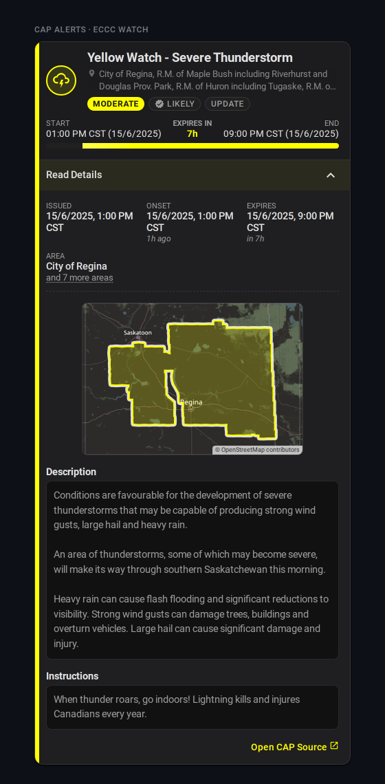
The grid's area row collapses a list of more than four names to the first one plus an "and N more areas" toggle, so an ECCC Prairie watch naming 100+ municipalities doesn't push the mini-map and description below the fold. Four or fewer render in full.
Affected-area mini-map
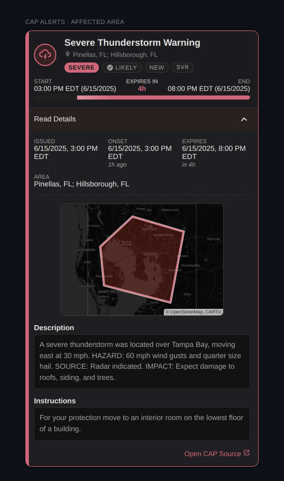
showGeometry draws whatever geometry the alert carries, best first:
| Alert carries | Providers | Mini-map shows |
|---|---|---|
| polygon (+ bbox) | CAP Alerts | bounding-box frame immediately, polygon outline once fetched out of band (frame alone on a cache miss) |
| bbox only | INMET, CAP Alerts with polygon unavailable | the bounding-box frame |
| point only | NSW RFS, CAP Alerts with a marker and no polygon (the Australian state feeds) | a severity-colored marker at the incident inside a ~20 km frame — town scale on the map style |
| polygon + point | CAP Alerts (an Australian fire with a fire-ground polygon and a location marker) | the polygon in its own frame; the marker still drives maxDistanceKm and the distance row |
| nothing | NWS, BoM, DWD, MeteoAlarm, MeteoSwiss, ECCC, NINA, PirateWeather | no mini-map |
A polygon can be a single storm-based shape, as above, or a few hundred rings. ECCC issues its watches per forecast region, so one alert arrives as a MultiPolygon of every area it names, and the frame is the whole extent. The card draws those regions as one shape: a single tint over the union and one outline around the outside, since the borders between regions are the issuer's tiling rather than anything the alert distinguishes. Separate parts, such as islands, keep their own outlines.
For a point incident the frame is invented by the card, not published by the feed, so it carries no tint: it's a viewport, not an affected area. A lone dot in an empty frame says little on the 'shape' style; 'map' gives it terrain, and showMyLocation gives it you.
The three together are the point-incident setup worth copying. With the NSW RFS feed auto-collected by source, and sortOrder: distance so the nearest fire leads:
type: custom:weather-alerts-card
sources:
  - nsw_rural_fire_service_feed
showGeometry: true
geometryStyle: map
showMyLocation: true
sortOrder: distance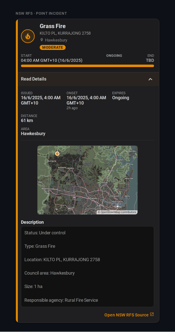
Leave maxDistanceKm out of this one: the RFS integration already trims its feed at its own radius (20 km by default), so a wider card value changes nothing (see Filtering and sorting).
showMyLocation: true adds a small neutral ring at the card's reference point — HA home, or the myLocationEntity entity — under the incident marker. On a point map the frame widens to hold both, up to ~150 km apart (beyond that the ring is dropped rather than zooming the incident out of all context). On a polygon map the frame is the alert's own extent and is never widened: a reference point outside it simply clips. It's opt-in because it draws your location, live when a tracker is set, onto a card that may sit on a shared wall display.
geometryStyle: 'map' goes online
The default 'shape' is fully offline. 'map' fetches map tiles, and is opt-in for that reason. The default source is Home Assistant's own map_tiles proxy (core 2026.9 and later), the same OpenStreetMap tiles HA's map draws: the requests go to your instance, which fetches them upstream, so no third party sees the alert's bounding box. For a point incident the tile requests reveal the incident's surroundings rather than an area, and with showMyLocation the frame is centred on your surroundings too — still only ever to your own instance on the default source. Dark themes invert the tiles the way HA's map does. On an older core the proxy doesn't exist and the card draws the plain outline instead, as it does whenever tiles fail.
Bringing your own tiles
geometryTileUrl takes any slippy-map template and is rendered as-is, with no dark inversion. Point it at a self-hosted server, or at a keyed provider: CARTO's rasters need an API key since August 2026, so the old default now watermarks every tile. With your own key it still works, and geometryTileAttribution should credit it:
geometryStyle: map
geometryTileUrl: https://basemaps.cartocdn.com/rastertiles/voyager/{z}/{x}/{y}.png?key=YOUR_KEY
geometryTileAttribution: © OpenStreetMap, CARTO
An override reveals the alert's bounding box to that host.
Broken sources
| Option | Default | Description |
|---|---|---|
unavailableBehavior | 'message' | 'message', 'compact', 'hide' |
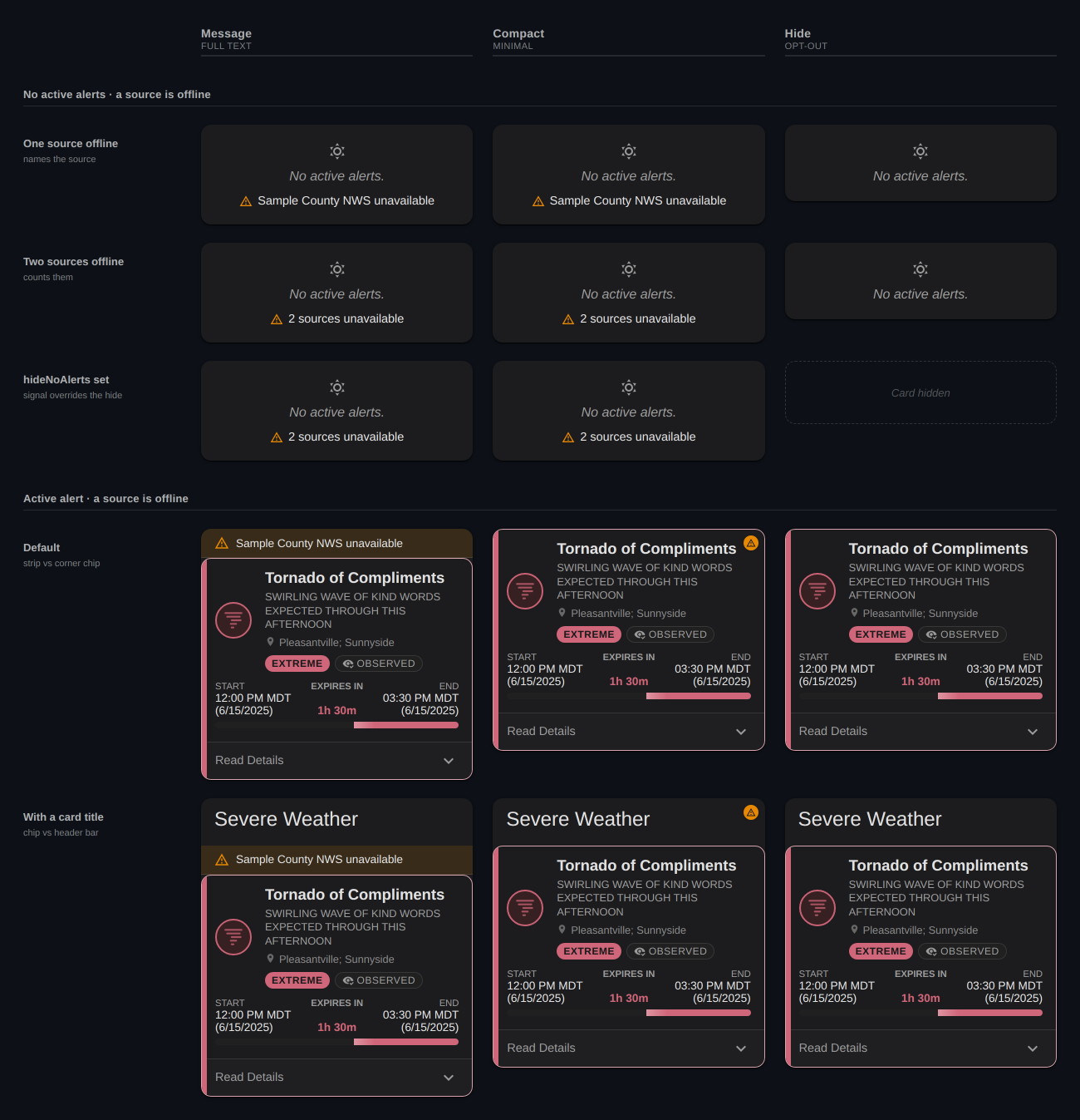
When some or all configured sources are broken — unavailable or unknown, with no parseable alert — the card shows a degraded badge above its content rather than rendering an empty, reassuring card. A dead feed is not proof of safety.
'message'— the badge names the broken source (and counts them when there is more than one).'compact'— an icon-only badge.'hide'— no badge. Not recommended.
A visible badge keeps the card on screen even under hideNoAlerts. The card hides completely only when there are no alerts and hideNoAlerts is set and either unavailableBehavior: 'hide' or nothing is actually broken.
Dismissal
| Option | Default | Description |
|---|---|---|
allowDismiss | false | Let users dismiss individual alerts (browser-local) |
dismissTrigger | 'button' | 'button', 'swipe', or 'both' — swipe covers touch and mouse drag |
dismissButtonStyle | 'icon' | 'icon' or 'labeled' (icon + "Dismiss" text) |
showDismissUndo | true | Show an Undo toast when an alert is dismissed |
Dismissal is browser-local — it is a way to clear something you have already read off your own screen, not a shared acknowledgement. A restore-all control brings dismissed alerts back, and an alert re-surfaces on its own if its severity, issue time, expiry, or phase changes.
dismissButtonStyle has no effect when dismissTrigger: 'swipe' (no button is rendered), and the compact layout is always icon-only.
Tap actions
| Option | Default | Description |
|---|---|---|
tap_action | — | Standard Home Assistant action fired when an alert row is tapped |
Setting tap_action replaces the inline expand affordance. The whole row becomes the tap target, and the compact chevron / "Read Details" toggle is removed. In layout: default, expandDetails: true still renders the always-on detail panel below the row.
Supported actions: details, more-info, navigate, url, toggle, call-service (alias perform-action), fire-dom-event, none.
detailsis card-owned rather than a standard HA action: it opens the tapped alert in a modal showing the whole alert body, per-alert for every provider and with no add-ons. See Per-alert detail pop-up.more-info/toggleresolve their entity per tapped alert —tap_action.entity(explicit) → the alert's own source sensor →entity. So per-alert providers (CAP Alerts, NSW RFS) open that alert's sensor, while aggregate providers (NWS, DWD, …) fall back to the aggregate sensor.toggleuses the generichomeassistant.toggleservice.noneis an inert chip: the toggle is removed but tapping does nothing.assistis intentionally unsupported — it has no meaning on an alert row.
Omitting tap_action entirely leaves today's inline expand/toggle behaviour unchanged.
Examples
Basic
type: custom:weather-alerts-card
entity: sensor.nws_alerts_alerts
BoM with a title and zone filtering
type: custom:weather-alerts-card
entity: sensor.sydney_warnings
provider: bom
title: Weather Alerts
zones:
  - NSW_FL049
NWS official colors, compact, sorted by severity
type: custom:weather-alerts-card
entity: sensor.nws_alerts_alerts
colorTheme: nws
layout: compact
sortOrder: severity
NWS filtered to specific event types, in browser time
type: custom:weather-alerts-card
entity: sensor.nws_alerts_alerts
eventCodes:
  - TOR
  - SVR
timezone: browser
DWD current + advance warnings merged
type: custom:weather-alerts-card
entity: sensor.dwd_weather_warnings_current
entities:
  - sensor.dwd_weather_warnings_advance
CAP Alerts — auto-discover every alert sensor under a device
type: custom:weather-alerts-card
device: 1a2b3c4d5e6f7a8b9c0d1e2f3a4b5c6d
Two CAP Alerts devices — home zone plus a GPS tracker
Every CAP Alerts entry is one provider for one scope, so a second location or provider is a second device. The editor's device selector is multi-select and writes this shape: first pick to device, the rest to devices.
type: custom:weather-alerts-card
device: 1a2b3c4d5e6f7a8b9c0d1e2f3a4b5c6d      # NWS, home zone
devices:
  - 9f8e7d6c5b4a39281706f5e4d3c2b1a0    # NWS, GPS tracker for the car
Per-provider examples live on the Providers page.
Config schema
For reference, the full TypeScript shape the card accepts:
interface WeatherAlertsCardConfig {
  entity: string;              // required — e.g. "sensor.nws_alerts_alerts"
  entities?: string[];         // additional entities to merge alerts from
  device?: string;             // HA device_id — auto-discovers per-alert sensors under it
  devices?: string[];          // additional device ids, same shape `entities` gives `entity`
  sources?: string[];          // feed `source` values to auto-collect, re-scanned each render
  title?: string;              // optional card header
  zones?: string[];            // zone filter — e.g. ["COC059", "COZ039"]
  eventCodes?: string[];       // event codes to include — empty/omitted = all
  excludeEventCodes?: string[]; // event codes to exclude — empty/omitted = none
  minSeverity?: AlertSeverity; // 'all' | 'minor' | 'moderate' | 'severe' | 'extreme'
  maxDistanceKm?: number;      // km from the reference point (HA home, or myLocationEntity); alerts carrying a point only
  myLocationEntity?: string;   // device_tracker / person / zone that replaces HA home as the reference point
  sortOrder?: 'default' | 'onset' | 'severity' | 'distance';
  animations?: boolean;        // undefined: respect prefers-reduced-motion; true/false: force
  layout?: 'default' | 'compact';
  fontSize?: 'small' | 'default' | 'large' | 'x-large';
  colorTheme?: 'severity' | 'nws' | 'meteoalarm' | 'eccc';
  providerColors?: boolean;    // undefined/false: colorTheme only; true: an alert's published color wins. Defaults on under colorTheme: 'eccc'
  enhanceContrast?: 'off' | 'subtle' | 'strict';
  provider?: AlertProvider;    // undefined: auto-detect
  deduplicate?: boolean;
  deduplicateHeadlines?: boolean;
  reformatText?: boolean;      // strip hard line wraps from alert text
  hideExpired?: boolean;
  hideNoAlerts?: boolean;
  showDetails?: boolean;
  expandDetails?: boolean;     // details always visible, toggle removed
  showProvider?: boolean;
  showMetadata?: boolean;
  showDescription?: boolean;
  showInstructions?: boolean;
  showSourceLink?: boolean;    // false for kiosk mode
  timezone?: 'server' | 'browser';
  allowDismiss?: boolean;      // browser-local, keyed on entity-set hash
  showDismissUndo?: boolean;
  dismissTrigger?: 'button' | 'swipe' | 'both';
  dismissButtonStyle?: 'icon' | 'labeled';
}