Theming
Two separate things are called "theming" here, and they are configured differently:
- Alert colors — which palette maps a severity or an event code to a color. This is a card option,
colorTheme. - Surfaces — backgrounds, borders, corners, shadows, translucency. These are not card options; they are CSS custom properties you set from theme YAML, card-mod, or a dashboard
style:block.
Color themes
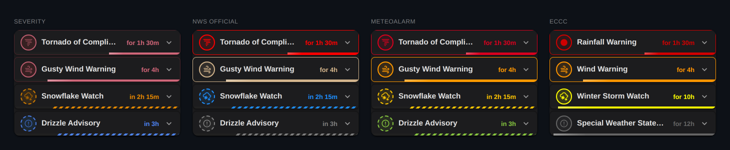
colorTheme | Palette |
|---|---|
'severity' (default) | The card's own severity ladder — extreme, severe, moderate, minor, unknown |
'nws' | The National Weather Service's official per-event colors, keyed by event name |
'meteoalarm' | MeteoAlarm awareness-level colors, keyed by severity tier |
'eccc' | ECCC's published red / orange / yellow / grey palette, matching weather.gc.ca, keyed by severity tier |
'severity' is provider-agnostic and always works. The other three are agency palettes, and each applies to every alert on the card whatever its provider: 'meteoalarm' and 'eccc' paint by tier, so a DWD alert gets ECCC's orange under 'eccc', and 'nws' paints by event name, so an ECCC or BoM "Flood Warning" gets NWS's green while a DWD or INMET event the table does not know drops to the severity tier.
Published colors (providerColors)
Some agencies publish a color with each alert: ECCC tags every alert red, orange, yellow or grey, MeteoAlarm members carry an awareness color (natively or through CAP Alerts), and INMET sends a literal hex. providerColors: true paints each such alert in that color and leaves the rest of the card on the colorTheme palette, so a mixed card never invents a color for an alert whose issuer did not supply one.
colorTheme: 'eccc' turns this on unless you set it false. That theme always meant "ECCC's ladder, and each ECCC alert in the color ECCC published for it", and it still does.
Agency palettes were designed for print and for maps, so a few of their colors read poorly on a dashboard card in one theme mode or the other. enhanceContrast corrects this per event and per mode — see the configuration reference.
Surface theming (--wac-* tokens)
The card exposes a small, stable set of CSS custom properties for its surfaces. Unset, every token falls back to the value the card has always used, so the default look is unchanged.
The outer <ha-card> is the single painted surface; each alert box defaults to a transparent fill and reveals it. That means a translucent theme (--ha-card-background: rgba(...)) renders its alpha exactly once, instead of compounding into a "solid" look on the alert bodies. The standard --ha-card-background, --ha-card-border-radius and --ha-card-box-shadow also work as expected.
| Token | Default | Controls |
|---|---|---|
--wac-card-background | var(--ha-card-background, var(--card-background-color)) | Outer card wrapper fill |
--wac-alert-background | transparent | Per-alert box fill (reveals the outer surface) |
--wac-alert-border-radius | 12px (full) / 8px (compact) | Per-alert corner radius |
--wac-alert-border | 1px solid var(--divider-color) | Per-alert border |
--wac-alert-shadow | var(--ha-card-box-shadow, 0 2px 5px rgba(0,0,0,0.1)) | Per-alert shadow |
--wac-alert-gap | 16px (full) / 4px (compact) | Vertical gap between alerts |
--wac-progress-fill-color | var(--wac-progress-fg) | Wash color for progressFill: background |
--wac-progress-fill-opacity | 0.10 (light) / 0.14 (dark) | Wash strength |
--wac-progress-fill-expired-opacity | 0.06 | Dimmer wash for expired rows |
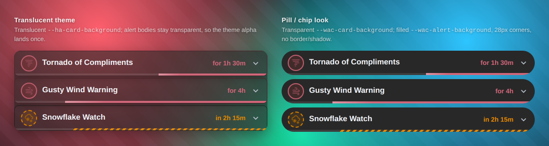
Left: a translucent theme — the alert bodies stay transparent, so the surface alpha lands once. Right: a pill/chip look — a transparent wrapper with filled boxes. Both come from the examples below.
The progress-fill tokens inherit the severity color and its contrast boost. Their opacity is deliberately low: the wash sits behind alert text, and a stronger tint costs legibility. Tune it down, or to 0, rather than up.
Examples
These use card-mod for a per-card override. The same properties work in theme YAML if you want them applied globally.
Translucent theme
Set a translucent card background and let the alert boxes inherit it. This is already the default behaviour; it is spelled out here as a per-card override.
type: custom:weather-alerts-card
entity: sensor.nws_alerts_alerts
provider: nws
card_mod:
  style: |
    ha-card {
      --ha-card-background: rgba(40, 40, 40, 0.6);
      --wac-alert-background: transparent; /* default; alert bodies stay translucent */
    }
Pill / chip look
Filled alert boxes on a transparent wrapper, approximating a Bubble Card style. Contributed in #144.
type: custom:weather-alerts-card
entity: sensor.nws_alerts_alerts
sortOrder: severity
layout: compact
provider: nws
card_mod:
  style: |
    ha-card {
      --wac-card-background: transparent;
      --ha-card-box-shadow: none; /* flatten the now-invisible outer wrapper */
      --wac-alert-background: rgb(40, 40, 40);
      --wac-alert-border: none;
      --wac-alert-border-radius: 28px;
      --wac-alert-shadow: none;
      --wac-alert-gap: 8px;
    }
Note --ha-card-box-shadow: none alongside the tokens: with a transparent --wac-card-background, the outer <ha-card> would otherwise still cast its own shadow around the now-invisible wrapper.
This snippet is dark-mode only
rgb(40, 40, 40) is a hardcoded dark fill — it will look wrong under a light theme. Use var(--card-background-color), or a prefers-color-scheme pair, if you switch modes.
What is not a public API
Deeper layout tweaks — row height, icon chip size — still require reaching into the card's internal class names. Those are not a stable interface and may change between releases without a major version bump. Prefer the tokens above wherever they suffice, and open an issue if something you need has no token.