Bubble Card pop-up
Send the compact layout's rows to a Bubble Card pop-up instead of expanding them inline.
Consider the built-in pop-up first
tap_action: { action: details } needs no add-ons and scopes to the tapped alert. Use this recipe when you specifically want Bubble's pop-up chrome, or when your dashboard is already built around it.
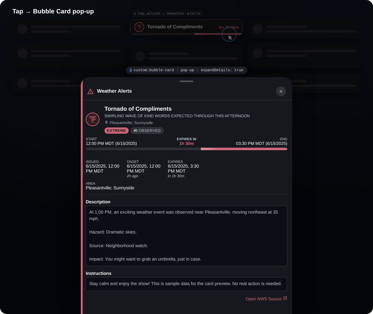
How it works
tap_action navigates to the pop-up's hash; the second card is the pop-up, because Bubble listens for that hash and opens. Pair it with hideNoAlerts so the entry rows vanish when there is nothing to show.
# 1) The entry rows: each row taps through to the shared pop-up
type: custom:weather-alerts-card
entity: sensor.nws_alerts_alerts
provider: nws
layout: compact
hideNoAlerts: true
tap_action:
  action: navigate
navigation_path: '#weather-alerts'# 2) The pop-up: one full-detail card behind the hash, listing every current alert
type: custom:bubble-card
card_type: pop-up
hash: '#weather-alerts'
card:
type: custom:weather-alerts-card
entity: sensor.nws_alerts_alerts
provider: nws
expandDetails: trueTwo things to know before wiring this up
The pop-up is shared, not per-alert. A Bubble hash addresses one static pop-up, so every row navigates to the same one and it shows all current alerts in full detail — not only the alert you tapped. Per-alert scoping cannot be expressed with a hash; that is exactly what action: details is for. To open the tapped alert's own HA entity dialog instead, use tap_action: { action: more-info }.
layout: compact renders one row per alert, not a single summary chip. With three active alerts you get three entry rows, all tapping through to the same pop-up.
Making the card dissolve into the sheet
By default the embedded card paints its own surface, so it stacks a second bordered box inside the pop-up. The --wac-* tokens drive it transparent so it reads as part of the sheet:
card_mod:
  style: |
    ha-card {
      --wac-card-background: transparent;
      --wac-alert-background: transparent;
      --wac-alert-border: none;
      --wac-alert-shadow: none;
      --ha-card-box-shadow: none;
    }
This is the same principle the figure above illustrates: one painted surface (the sheet), with the alert's severity shown as a single edge stripe rather than a perimeter frame.
browser_mod
For a browser_mod-style pop-up, use tap_action: { action: fire-dom-event, browser_mod: { ... } } — the card fires the standard ll-custom event that browser_mod listens for.